On-time promise
We run on schedule. If we keep you waiting more than 15 minutes, your hygiene visit is free.
Features is the section that carries most marketing pages: services, benefits, capabilities. Below, one dental practice presents the same services through every display style and card style the section supports.
The classic card grid. Surface, border, radius, and icons, all driven by the global design system.


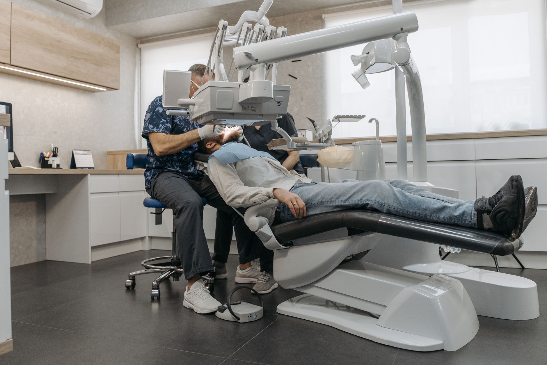



Every card defaults to image-on-top — but a single Image Position toggle moves the photo below the content instead: heading and copy first, then the image. Nothing else about the card changes (surface, radius, spacing, smart colors all stay put), so it still matches the grid above; only the image order flips. Compare it with the grid directly above.
Minimal drops the card surfaces so the content sits directly on the section. Best when the page already has plenty of cards.
The bordered treatment draws a connected rule between cards, a quieter alternative to full card surfaces.
Hero cards are image-led and fully clickable, with a persistent arrow affordance.
Inline consolidates one or two cards beside the section copy instead of below it. With the Cards style they render as true cards, honoring the global card treatment.
The same inline composition with the Minimal card style: no surfaces, just aligned content beside the message.
Showcase highlights two or three image-rich cards with extra emphasis and spacing, built for focal-point moments.
The offset composition: copy and stacked items in a left column while the featured image bleeds to the right edge of the viewport. A deliberate editorial break in the page rhythm.
The Events display mode adds date, time, and location fields to every card, turning the section into a schedule.
The carousel arrangement puts the same service cards on a horizontal scroll-snap rail. Auto sizing fits about three cards on desktop with a peek of the next; drag, arrows, dots, and the keyboard all navigate. Switching a grid to a carousel changes nothing about the cards themselves.
A fixed three-up count with peek on: exactly three cards fill the width and a sliver of the fourth signals there is more to scroll. Dark theme, arrows and dots re-derive their contrast automatically.
Four cards per view with peek off, so exactly four fill the width with no sliver. The minimal card style drops the surfaces, and dots are hidden — arrows, swipe, and keyboard still navigate.
Two cards per view with autoplay and loop on: the rail advances every four seconds and wraps at the ends. A pause/play button appears; it pauses on hover, on keyboard focus, and when the tab is hidden, and never starts under reduced motion.
Slides-per-view of one is the spotlight treatment: each card with an image lays out as a large media-and-copy split you page through, the modern feature-tour format. Autoplay advances every six seconds; the same lossless cards, a bigger stage.